

Your Microsoft Copilot dashboard is not being deceptive. It is doing exactly what it was built to do: demonstrate licence utilisation to support a renewal conversation. The problem is that what Microsoft designed the dashboard to prove is fundamentally different from what the Head of AI and Automation is hired to prove. When the person accountable for benefits realisation uses adoption metrics to evidence portfolio ROI to the board, the credibility gap sits in the reporting method, not in Microsoft’s product.
The Copilot dashboard has an Impact tab. It calculates a number called “Copilot Assisted Value.” That number looks like a commercial outcome. It is not. It is a calculation built on Microsoft’s own research multipliers, priced at a fixed hourly rate drawn from US Bureau of Labor Statistics data, applied to estimated time savings that Microsoft defined. No line on your P&L will ever move because the Impact tab increased. Your senior stakeholders need to understand exactly why, because the M365 E7 Frontier Suite is now at $99 per user per month and the renewal conversation is already happening.
What the Microsoft Copilot ROI Dashboard Actually Measures
The Copilot dashboard reports across three categories: adoption, estimated time impact and user sentiment. Each fails the benefits realisation test in a different way.
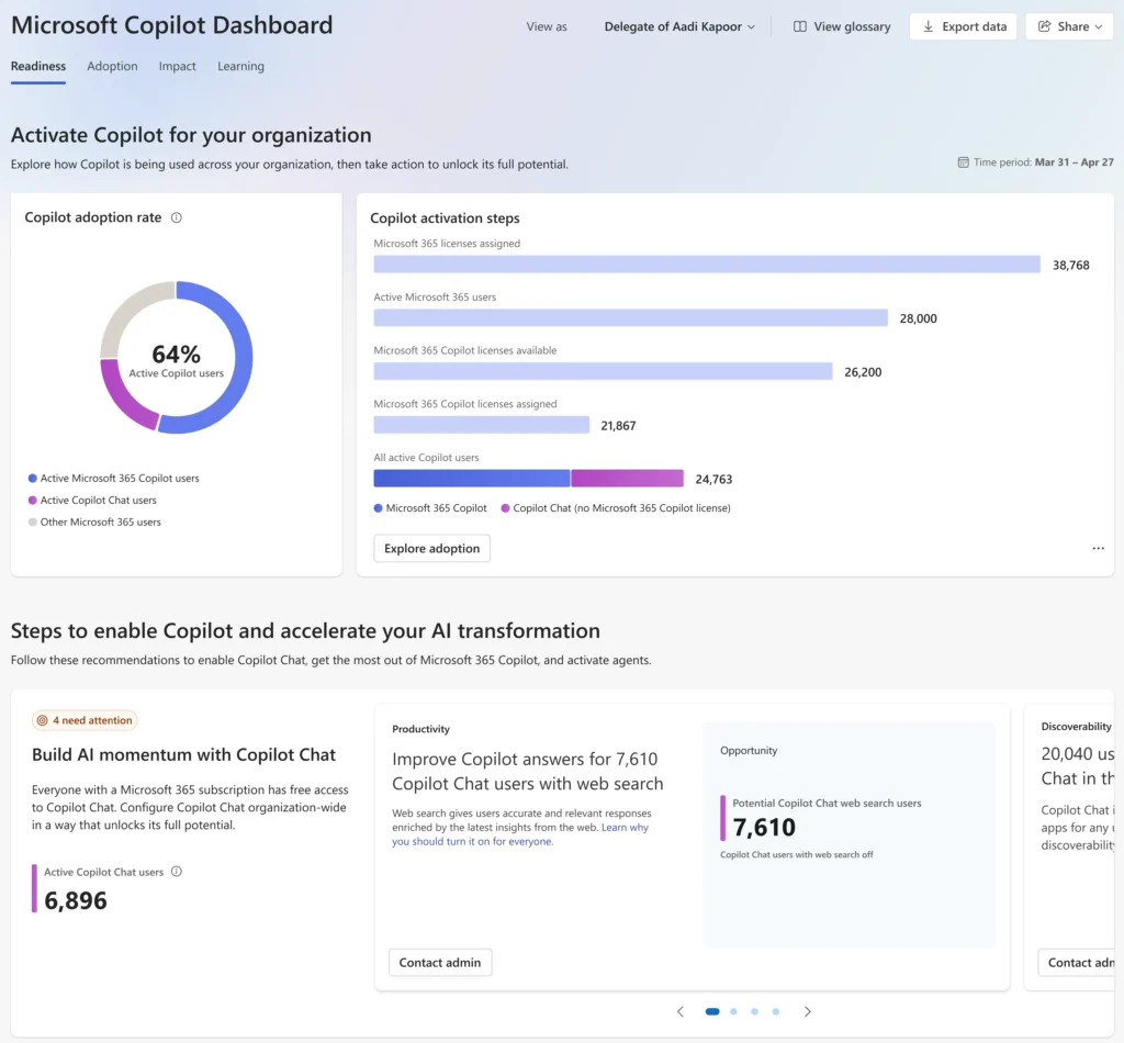
Adoption metrics cover active users, feature usage counts and trend lines showing which Copilot capabilities are being used across which Microsoft 365 workloads. These tell you how many people opened Copilot and what they did with it. They do not tell you whether anything changed in your cost base as a result.
Estimated time impact is where the dashboard gets closest to a financial figure, and where the argument gets specific. The flagship metric “Copilot Assisted Hours” is calculated by multiplying recorded usage actions by time-saving multipliers from Microsoft’s own research: 6 minutes per search or summarisation action, 6 minutes per creation action. These multipliers were derived from Microsoft-commissioned studies and applied uniformly across every user, every industry and every workflow context. They are not measured in your organisation.
“Copilot Assisted Value” takes those estimated hours and multiplies them by $72 per hour, a default rate derived from US Bureau of Labor Statistics average hourly compensation data. The result is a dollar figure produced entirely from Microsoft’s assumptions, at a wage rate that may have no relationship to your actual salary structure. This is the Vendor Math Trap in its clearest form: a number that carries the visual weight of a commercial outcome while connecting to nothing on your P&L.
User sentiment is a thumbs-up/thumbs-down signal that requires at least 30 responses from a minimum of 5 users before it displays. It is the only qualitative data point in the dashboard, and it measures whether users found a specific Copilot interaction helpful, not whether that interaction changed an output, reduced an overhead or contributed to a cost line.
Three Reasons This Doesn’t Serve as a Financial Audit
Three characteristics of the Microsoft Copilot ROI Dashboard confirm it was built for licence management, not benefits realisation governance.
The Rolling Window Problem
The dashboard operates on 28-day rolling windows with up to six days of processing delay. There is no way to view trends over time. There is no comparison against a baseline period. There is no mechanism to load the original business case that justified the Copilot purchase and check it against current data. The Forecast vs. Realized Loop, the governance mechanism that runs actual P&L movement against the original financial forecast, does not exist anywhere in the Microsoft reporting stack. A tool without a baseline cannot tell you whether anything improved.
The Silent Delicensing Problem
When a user loses their Copilot licence, they are removed from all dashboard analyses immediately. The ROI picture can improve not because Copilot is delivering more value, but because the users generating the least Copilot engagement have been removed from the calculation. A team that started with 50 Copilot seats, saw low adoption from 15 users and then removed those 15 licences will show improved active user rates and higher Copilot Assisted Hours per active user in the following reporting period. The dashboard will not flag this. A senior stakeholder reviewing the numbers will see improvement. That improvement is a result of how the reporting methodology works, not evidence of better commercial outcomes.
The Eight-Month Underreporting Bug
Between June 1, 2025 and February 18, 2026, Microsoft’s own documentation admits that “Copilot Assisted Hours” and “Copilot Assisted Value” figures were understated for email drafting and email summarisation tasks. The underreporting affected these metrics across the entire period. Eight months of inaccurate data in the dashboard’s closest approximation of financial impact, self-reported in Microsoft’s own product documentation.
This is the Vendor Dashboard Bias argument with a timestamp and a primary source attached. The metric is already an estimate, built on Microsoft-defined multipliers and a standardised hourly rate. During an eight-month window, it was also silently wrong. No Head of AI or Automation presenting a benefits realisation report at the annual planning cycle should be relying on it as primary evidence. No Section 151 officer in local government could submit it as VfM evidence. No senior stakeholder receiving the portfolio health report should treat Copilot Assisted Value as a P&L figure.
What the Microsoft Copilot ROI Dashboard Was Actually Built to Do
The Microsoft Copilot ROI Dashboard was designed around the questions Microsoft needs to answer, not the ones your board will ask. Microsoft’s commercial focus is licence renewals and licence upgrades. The adoption dashboard serves that focus well. It shows which features are being used, identifies underutilising departments that might benefit from further rollout and generates a “Copilot Assisted Value” figure that can appear in an internal champion’s presentation to support the renewal conversation.
This makes sense for product design: the renewal conversation Microsoft needs to have is about utilisation and engagement, not your EBITDA, and the dashboard is built precisely for that conversation. The problem arises when it gets imported into a different one, the board-level benefits realisation question, where it cannot perform.
The Vendor Dashboard Bias is built into the product’s purpose, not a deliberate choice anyone made. The audit mechanism that would tell you whether Copilot moved a cost line is simply not what this tool was designed to produce. That audit has to come from a layer that sits outside any individual vendor’s reporting chain.
What the Right Measurement Looks Like
The benefits realisation question that Heads of AI and Automation are being hired to answer has a clear methodology, and it is not complicated. Start with the original business case: the document that projected specific commercial outcomes from the Copilot investment, projected headcount avoidance and measurable reductions in defined cost lines. That document exists. It was used to justify the purchase
Capacity Released is the metric that connects Copilot activity to the P&L. It measures whether time freed by Copilot converted to a change on a cost line, through headcount avoidance, reduction in agency or contractor spend, absorption of demand growth without additional FTE, or redeployment to higher-value activities with a measurable revenue or margin impact. Copilot Assisted Hours is an estimate of time freed. Capacity Released is a measure of what happened to that time. The gap between them is where the Value Realization Gap lives.
Most Copilot deployments sit on a foundation that makes evidencing ROI structurally impossible. The business case is a spreadsheet built at intake and never revisited once deployment began. The Copilot dashboard measures usage, not commercial outcomes. There is no single source of truth connecting which use cases are live, which cost lines they target and which benefits they were approved to deliver. The monthly portfolio health report gets assembled from multiple systems into a deck, none of which show actual P&L movement against the original forecast. The Forecast vs. Realized Loop cannot close a loop that was never built.
Closing that loop requires a value measurement approach that runs across the full initiative lifecycle. AI-assisted intake structures every proposed Copilot use case from the start, capturing the cost line it targets and the projected commercial outcomes before any resource is committed. Solution Blueprints, pre-built ROI models for specific technology deployments including Microsoft Copilot, generate board-ready financial models within minutes rather than weeks of manual spreadsheet work. This creates a governed evidence base the moment each use case is approved.
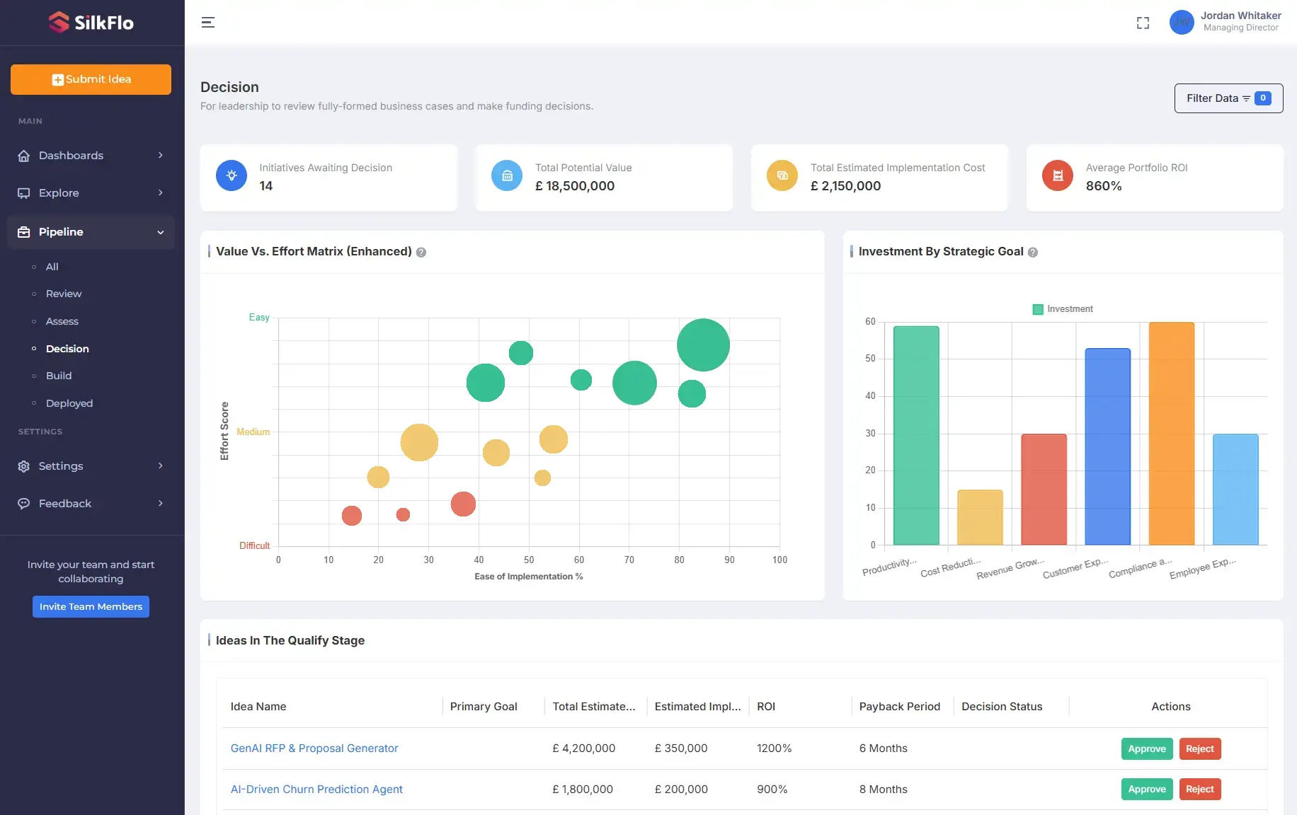
Closing that loop requires a value measurement approach that runs across the full initiative lifecycle. AI-assisted intake structures every proposed Copilot use case from the start, capturing the cost line it targets and the projected commercial outcomes before any resource is committed. Solution Blueprints, pre-built ROI models for specific technology deployments including Microsoft Copilot, generate board-ready financial models within minutes rather than weeks of manual spreadsheet work. This creates a governed evidence base the moment each use case is approved.
Once live, the Realized Value Ledger tracks actual P&L movement in the affected functions against those original projections month by month, drawing from the organisation’s own financial systems rather than from any vendor’s reporting stack. The comparison spans hard KPIs such as headcount avoidance and agency cost reduction as well as soft KPIs such as processing throughput and service delivery scores. Delivery health across the portfolio, which use cases are generating realized value against forecast and which are widening the gap, is visible in a single dashboard rather than assembled from six systems into a monthly deck. A Value vs. Effort Matrix surfaces the use cases driving the most realized return so portfolio decisions rest on evidence rather than opinion.
What makes the audit credible is independence from the vendor relationship. SilkFlo sits above Microsoft Copilot, UiPath, Power Automate, Salesforce and every other platform in the enterprise stack in a single vendor-agnostic view, covering every stage from AI-assisted intake through to post-deployment benefits tracking. That is what allows the Head of AI or Automation to replace the manual monthly reporting cycle with a governed, board-ready benefits realisation system.
What Good Looks Like: Two Benchmarks
Aviva’s Claims Innovation team faced exactly the situation this article describes. A year into multiple AI and automation deployments, the use case intake was on a Miro board and the benefits realisation evidence lived in a few excel files showing estimated hours saved, none of which connected to the P&L. Using SilkFlo’s AI-assisted intake and Solution Blueprints, the team structured 102 automation and AI opportunities from across the business into board-ready financial business cases in three weeks, with evidenced commercial outcomes for each. The result was £12 million in trackable cost savings identified at 90 times lower cost than a traditional consulting engagement. Manual benefits realisation reporting time fell by 60%, and the intake process returned approximately 15 hours per month to every Business Analyst involved. The monthly portfolio health deck assembled across multiple systems was replaced by a single delivery health view showing realized value against the original business case, use case by use case.
Any Head of AI or Automation running a Copilot programme in UK financial services reaches this moment at the end of Year 1: the honeymoon period is over, adoption figures no longer satisfy the board and the accountability question becomes the commercial outcomes question. Having the value measurement approach in place before that conversation is what separates evidencing ROI from scrambling to construct it. Check how Silkflo helps Transformation and CoE leaders here.
Staffordshire County Council applied the same governance model in UK local government, deploying SilkFlo to produce a vendor-agnostic view of its full AI and automation portfolio covering Microsoft Copilot, UiPath and Power Automate across multiple service areas. The platform replaced manual initiative tracking across spreadsheets with a single Digital Asset Register showing Capacity Released and cashable savings against the original financial case for each deployment. When the external auditor asks what each AI investment delivered, Staffordshire answers with structured, evidenced data. For UK public sector organisations where the Section 151 officer carries the same accountability to external audit that a CFO carries to the board in financial services, this is what VfM evidence looks like when it is built continuously rather than assembled in response to a question.
What to Do Before the M365 E7 Decision
An independent audit of the current Copilot investment should come before any commitment to M365 E7 at $99 per user per month. Pull the original business case and identify what P&L outcomes it projected, for which functions and on what timeline. Pull actual OpEx data for those functions for the period since deployment. Calculate the gap between the forecasted change and the actual movement in the relevant cost lines.
That gap is the Forecast vs. Realized figure. It is the only number that tells you whether the current Copilot investment delivered its case, and it is the only defensible basis for a $99/user/month upgrade decision. If the gap is significant, it informs both the renewal terms and the scope of the E7 business case. If the gap is small, the Copilot programme has delivered and the upgrade conversation starts from a position of evidence.
The Copilot dashboard will not run this audit. The finance leader who treats Copilot Assisted Value as a P&L outcome is using a utilisation tool for a governance purpose it was never designed to serve.
Frequently Asked Questions
Q: Does Microsoft Copilot Dashboard report ROI? A: The Microsoft Copilot ROI Dashboard has an Impact tab that calculates “Copilot Assisted Value,” a figure produced by multiplying estimated hours saved (using Microsoft-defined time multipliers) by a default hourly rate of $72 drawn from US Bureau of Labor Statistics data. This is an estimate of potential value, not a measure of P&L impact. It does not connect to any cost line in the customer’s financial system and cannot replace an independent audit of actual financial outcomes against the original business case.
Q: What is the Vendor Math Trap in the context of Microsoft Copilot ROI Dashboard? A: The Vendor Math Trap is the use of vendor-supplied metrics to evaluate the ROI of the same vendor’s product. In the Copilot context, “Copilot Assisted Value” is calculated from Microsoft’s own research multipliers applied to usage actions, priced at a standardised US hourly rate. The input assumptions, the multipliers and the pricing are all defined by Microsoft. The figure cannot be independently verified and does not connect to the customer’s P&L. Between June 2025 and February 2026, Microsoft acknowledged that these figures were also understated due to an underreporting bug, making them inaccurate as well as unsuitable as financial audit evidence.
Q: Why can’t the Copilot dashboard serve as a financial audit trail? A: The dashboard has three characteristics that rule it out. It operates on 28-day rolling windows with no comparison against the original business case. Users who lose their licences are removed from all analyses, which can produce misleading improvements in per-user metrics. And the dashboard’s nearest equivalent to a financial figure, Copilot Assisted Value, was understated for eight months between June 2025 and February 2026 due to an acknowledged underreporting bug. An audit trail must be accurate and continuous, with a fixed baseline to compare against. The Copilot dashboard meets none of those criteria.
Q: How should an enterprise measure Microsoft Copilot ROI? A: Start with the original business case: what P&L outcomes were forecasted at the point of purchase, and for which functions? Then measure Capacity Released, whether the time freed by Copilot converted to reduced operating cost, headcount avoidance or reallocation to higher-value activities, by pulling actual OpEx data for those functions pre- and post-deployment. Run the Forecast vs. Realized comparison monthly. SilkFlo provides the independent governance layer that automates this process across the full enterprise AI portfolio, independently of any vendor’s own reporting.
Q: Should my organisation upgrade to M365 E7? A: The governance question that should come before that decision is: what did the current Copilot investment deliver, measured against the P&L? If you cannot answer that question with data from your own financial systems, not from the Copilot dashboard, you are evaluating a $99/user/month commitment on an unaudited foundation. Run the Forecast vs. Realized audit first, then make the upgrade decision with the result in front of you.